
Google’s Material You design language, first introduced in Android 12, has been lauded for its dynamic color palettes and playful animations. But the tech giant isn’t resting on its laurels. Recent updates reveal a focus on refining existing elements, with the latest iteration bringing subtle yet impactful changes to two crucial UI components: sliders and progress bars.
From Boxy to Sleek: Progress Bars with Personality
Gone are the days of the plain rectangular progress bars. Material You’s revamped version embraces rounded corners, mirroring the overall design philosophy’s emphasis on softness and fluidity. This seemingly minor tweak has a tangible impact, making the UI feel more modern and cohesive.
But the changes go beyond aesthetics. Google has introduced a subtle gap between the track (the background bar) and the active indicator (the portion that visually denotes progress). This seemingly simple addition enhances accessibility, particularly for users with low vision or cognitive disabilities, by clearly differentiating between completed and ongoing tasks.
Furthermore, the end-stop indicators, marking the maximum and minimum values, have been subtly tweaked. They now appear as small circles at the edges, adding a touch of visual polish and further reinforcing the rounded aesthetic.
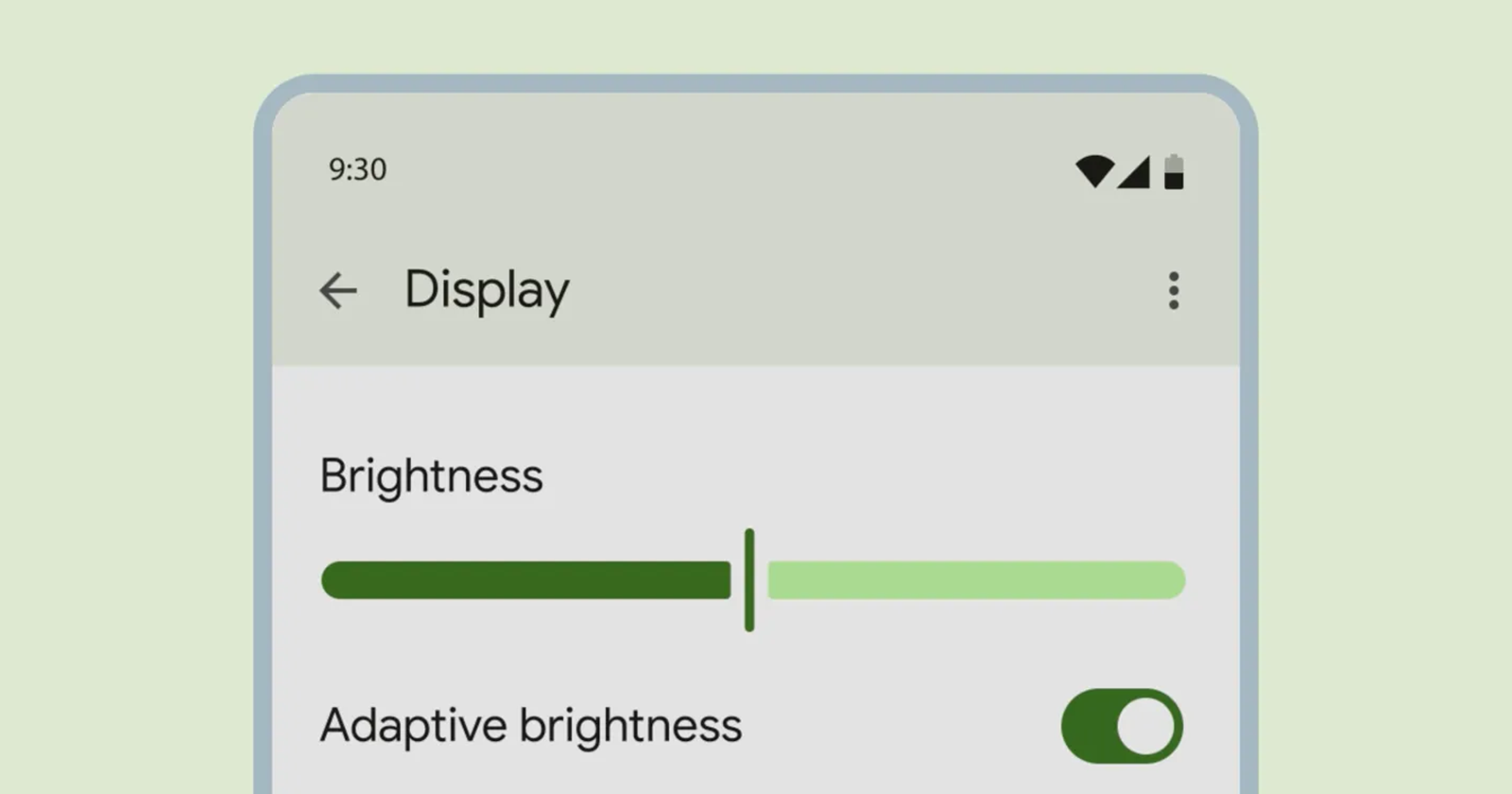
Sliders Get the Squeeze: Enhanced Control and Clarity
Sliders, those ubiquitous UI elements for adjusting settings like volume or brightness, haven’t escaped Google’s design refresh. The previous thin line track has been replaced with a thicker pill-shaped element, offering a larger target area for easier interaction. This is particularly beneficial for users with dexterity limitations or those using touchscreens with reduced sensitivity.
The slider handle itself has undergone a transformation as well. Gone is the circular knob; in its place stands a simple vertical line. This minimalist design choice declutters the UI and draws focus to the actual act of sliding, potentially improving precision and control.
Interestingly, the handle adapts its width dynamically. When not actively being adjusted, it becomes ultra-thin, minimizing its visual presence and allowing the track to take center stage. This subtle animation adds a touch of delight and reinforces the feeling of responsiveness.
More Than Aesthetics: A Focus on Usability and Accessibility
These seemingly minor revisions to sliders and progress bars showcase Google’s commitment to continuous improvement within its design language. It’s not just about making things look pretty; it’s about optimizing functionality and catering to a diverse range of users. The increased contrast, rounded corners, and larger touch targets all contribute to a more intuitive and accessible experience.
But Where Are the Pixel Updates?
Eagle-eyed Android enthusiasts might be wondering when and where these changes will make their Pixel debut. While the new progress bars have already begun rolling out in some Google apps, the redesigned sliders are still awaiting their official launch. However, considering Google’s focus on consistent design within its ecosystem, it’s safe to assume that these updates will gradually trickle down to Pixel devices and potentially other Android skins in the near future.
The Material You Journey Continues
Google’s Material You is a dynamic and evolving design language. The recent updates to sliders and progress bars demonstrate the company’s ongoing commitment to refine and improve the user experience. While these changes might seem small on the surface, their cumulative effect is undeniable, resulting in a UI that is not only visually appealing but also more intuitive, accessible, and enjoyable to use. As Google continues to iterate on Material You, one thing is certain: the journey towards a more refined and user-centric Android experience is far from over.
So, the next time you adjust the volume on your phone or watch a loading bar fill up, take a moment to appreciate the subtle improvements Google has made. These seemingly minor tweaks are a testament to the company’s dedication to crafting a design language that not only looks good but also makes our digital lives simpler and more delightful.
